library(networkD3)
library(tidyverse)
library(htmlwidgets)
library(manipulateWidget)
library(webshot2)
library(paletteer)Resistance genes in Escherichia coli
Generating and polishing Sankey diagrams in R
Sara Burgess, 14 November 2025
Sankey diagrams are used to illustrate flows from one item (node) to another. There are several R packages used to generate Sankey diagrams. This blog will demonstrate how to use the networkD3 and ggsankey packages.
Data
In these examples data was manually sourced from publications (as listed at the bottom of this blog) to visualise the different resistance genes and mechanisms that the bacterium Escherichia coli can use to become resistant to seven classes of antibiotics. The first Sankey diagram covers E. coli resistance to six classes of antibiotics (aminoglycosides, fluoroquinolones, tetracyclines, phenicols, sulfonamides and trimethoprim, nitrofurans). The second Sankey diagram shows how different beta-lactamase enzyme types confer resistance to different sub-classes of beta-lactams.
Generating a Sankey diagram using networkD3
The package networkD3 can be used for generating a variety of interactive network (as described in this geeksforgeeks blog.
Packages
If you haven’t done so already install the packages networkD3, tidyverse, htmlwidgets, manipulateWidget and webshot2.
Load the libraries
Read in and prepare data
The following code was adapted from the r-graph-gallery . Two data frames are needed to generate a Sankey diagram. One for the links and the other for the nodes. First read in your data for the links data frame.
links <- read_csv("data/resistance_mechanisms.csv")Rows: 75 Columns: 3
── Column specification ────────────────────────────────────────────────────────
Delimiter: ","
chr (2): source, target
dbl (1): value
ℹ Use `spec()` to retrieve the full column specification for this data.
ℹ Specify the column types or set `show_col_types = FALSE` to quiet this message.My csv file contains three columns: source, target, value. Source is the origin of each data link. Given, my Sankey diagram has three columns, source contains both the names of the antibiotic classes and the mechanisms. Target is the endpoint of each data link. This contains the mechanisms and resistance genes. Value is the thickness of each link.
#First six lines of my data frame
head(links)
# A tibble: 6 × 3
source target value
<chr> <chr> <dbl>
1 Aminoglycosides Enzymatic inactivation 14
2 Aminoglycosides Target alteration 8
3 Aminoglycosides Efflux pump 2
4 Fluoroquinolones Enzymatic inactivation 2
5 Fluoroquinolones Target alteration 8
6 Fluoroquinolones Target protection 2#Last six lines of my data frame
tail(links)# A tibble: 6 × 3
source target value
<chr> <chr> <dbl>
1 Efflux pump mphA 2
2 Efflux pump mphB 2
3 Efflux pump mefA 2
4 Efflux pump mefB 2
5 Efflux pump msrA 2
6 Efflux pump msrD 2The ' in some of my gene names is read in as ? so first I replaced the ? with ′.
links$target <- str_replace_all(links$target, "\\?", "′") Next I created a one column data frame for all the nodes. The column name is labelled name and the observations are all the unique names from source and target.
nodes <- data.frame(
  name = unique(c(as.character(links$source), as.character(links$target))))
A second column was added to the nodes data frame called group. This will be used to colour the Sankey diagram links by group.
# Grouping
nodes$group <- case_when(
  nodes$name == "Aminoglycosides" ~ "Aminoglycosides",
  nodes$name == "Fluoroquinolones" ~ "Fluoroquinolones",
  nodes$name == "Tetracyclines" ~ "Tetracyclines",
  nodes$name == "Phenicols" ~ "Phenicols",
  nodes$name == "Sulfonamides & Trimethoprim" ~ "Sulfonamides",
  nodes$name == "Nitrofurans" ~ "Nitrofurans",
  nodes$name == "Macrolides" ~ "Macrolides",
  nodes$name %in% c("aac(3′)", "aadA", "aadB", "aadD",
                    "aph(3′)", "aphA15", "rrsH*", "rsmG*") ~ "Aminoglycosides",
  nodes$name %in% c("gyrA*", "gyrB*", "parC*", "parE*", "qep", "qnr", "oqxAB") ~ "Fluoroquinolones",
  nodes$name %in% c("tetX", "tetM", "tetW", "tetA", "tetB", "tetC", "tetD") ~ "Tetracyclines",
  nodes$name %in% c("catB", "catII", "cmlA", "floR") ~ "Phenicols",
  nodes$name %in% c("dfr", "folP*", "sul1", "sul2", "sul3", "sul4") ~ "Sulfonamides",
  nodes$name %in% c("nfsA*", "nfsB*", "ahpF*", "ribB*", "ribE*") ~ "Nitrofurans",
  nodes$name %in% c("ermA", "ermB", "ermC", "ereA", "mphA", "mphB", "mefA", "mefB", "msrA", "msrD") ~ "Macrolides",
  TRUE ~ "Other"
)
Two additional columns were added, which contain an index for both the source and the target. The match function is used to match the position of the values that are being matched. As I understand it networkD3 uses an index system starting from 0, whereas base R starts from 1, hence the -1 is needed to generate an index system suitable for the function networkD3::sankeyNetwork().
# ID mapping
links$IDsource <- match(links$source, nodes$name) - 1
links$IDtarget <- match(links$target, nodes$name) - 1

links
# A tibble: 75 × 5
source target value IDsource IDtarget
<chr> <chr> <dbl> <dbl> <dbl>
1 Aminoglycosides Enzymatic inactivation 14 0 7
2 Aminoglycosides Target alteration 8 0 8
3 Aminoglycosides Efflux pump 2 0 9
4 Fluoroquinolones Enzymatic inactivation 2 1 7
5 Fluoroquinolones Target alteration 8 1 8
6 Fluoroquinolones Target protection 2 1 10
7 Fluoroquinolones Efflux pump 6 1 9
8 Tetracyclines Enzymatic inactivation 2 2 7
9 Tetracyclines Target alteration 4 2 8
10 Tetracyclines Target protection 4 2 10
# ℹ 65 more rowsSimilar to the nodes data frame a group column was also added to the links data frame.
#Generate vector containing the group names for all the antibiotic classes
class <- c("Aminoglycosides", "Fluoroquinolones", "Tetracyclines", "Phenicols", "Sulfonamides & Trimethoprim", "Nitrofurans", "Macrolides")
#Generate vector containing the group names for all the mechanisms
mechanisms <- c("Enzymatic inactivation", "Target alteration", "Target protection", "Efflux pump", "Target replacement", "Reduced prodrug activation")

# Assign groups
links$group <- case_when(
  links$source %in% class ~ nodes$group[match(links$source, nodes$name)],
  links$source %in% mechanisms ~ nodes$group[match(links$target, nodes$name)],
  TRUE ~ "Other")
Lastly I generated my colour scale. Here because networkD3 uses Javascript code the colour scale also has to be written in Javascript. '.domain' defines each group that I want to apply each colour to.
my_color <- 'd3.scaleOrdinal()
  .domain(["Aminoglycosides", "Fluoroquinolones", "Tetracyclines",
           "Phenicols", "Sulfonamides", "Nitrofurans", "Macrolides", "Other"])
  .range(["#90CAF9", "#A5D6A7", "#D1C4E9", "#ffffb3", "#fb8072", "#fdb462", "#F8BBD0FF", "#E0E0E0"]);'
Sankey diagram
Now for the fun part generating the Sankey diagram.
# Sankey plot
q <- sankeyNetwork(
  Links = links, Nodes = nodes,
  Source = "IDsource", Target = "IDtarget",
  Value = "value", NodeID = "name",
  NodeGroup = "group", LinkGroup = "group",
  colourScale = my_color,
  width = 900, height = 900,
  nodeWidth = 60
)
q
There are a few things I don’t like. The font size and type, as well as having the resistance genes on top of the links.
Here I’ve adjusted these three things within the sankeyNetwork() function using the arguments fontSize, fontFamily, and sinksRight.
# Sankey plot
p <- sankeyNetwork(
  Links = links, Nodes = nodes,
  Source = "IDsource", Target = "IDtarget",
  Value = "value", NodeID = "name",
  NodeGroup = "group", LinkGroup = "group",
  colourScale = my_color,
  fontSize = 12, fontFamily = "Verdana", nodeWidth = 60, sinksRight = FALSE, width = 900, height = 900
)
p
It’s still not quite what I’d like. To my knowledge that is pretty much all that can be adjusted within the SankeyNetwork() function. However, because the Sankey diagram is an htmlwidget (you can check this using the class function) you can use the htmlwidgets package to append labels.
class(p)[1] "sankeyNetwork" "htmlwidget" Using htmlwidgets to adjust the Sankey diagram
The code below was adapted from this tutorial and the response on this stack overflow post.
First I added a title to my diagram.
#prepend title
p1 <- htmlwidgets::prependContent(p, htmltools::tags$h1(htmltools::HTML("Resistance genes in <em>Escherichia coli</em>"),
  style = "text-align:center; color:#1b2422; font-size:18px; font-family:Verdana;"))
Next a footnote was added.
#append footnote
p2 <- htmlwidgets::appendContent(p1, htmltools::tags$p("* Genes with point mutations", style = "text-align:center; color:#666; font-size:12px; font-family:Verdana;"))
p2
* Genes with point mutations
I also changed the font style to bold for the antibiotic classes and italics for the resistance genes.
#The following function was generated using chapgpt
p3 <- htmlwidgets::onRender(p2, '
  function(el, x) {
    const boldNames = [
      "Aminoglycosides", "Fluoroquinolones", "Tetracyclines",
      "Phenicols", "Sulfonamides & Trimethoprim", "Nitrofurans",
      "Enzymatic inactivation", "Target alteration",
      "Target protection", "Efflux pump", "Target replacement",
      "Reduced prodrug activation", "Macrolides"
    ];

    const italicSubstrings = [
      "aac", "aad", "aph", "rr", "rsm", "qep", "qnr", "tet", "cat",
      "gyr", "par", "mdf", "fol", "dfr", "nfs", "cml", "flo", "oqx", "sul",
      "erm", "ereA", "mph", "mef", "msr", "ahpF", "rib"
    ];

    d3.select(el)
      .selectAll(".node text")
      .style("font-weight", d => boldNames.includes(d.name) ? "bold" : "normal")
      .style("font-style", d =>
        italicSubstrings.some(sub => d.name.includes(sub)) ? "italic" : "normal"
      );
  }
')

p3
Resistance genes in Escherichia coli
* Genes with point mutations
Saving the Sankey diagram
If you are trying this code or similar and want to save your plot as a png you will not be able to use the ggsave() function because the Sankey diagram is an htmlwidget. First save your plot as an html and then take a screenshot using webshot.
htmlwidgets::saveWidget(p3, "output/sankey.html", selfcontained = TRUE)
webshot("output/sankey.html", file = "output/sankey_arg.png", vwidth = 900, vheight = 900)
Generating a Sankey diagram using ggsankey.
In this example I used the package ggsankey to generate a Sankey diagram. Visualising the beta-lactam resistance genes was not as straight forward as the other resistance genes in the Sankey diagram above. There are multiple enzyme types, which all have a large number of variants. Certain variants have a wider range of resistance compared with their parent types, which adds in more complexity. For this reason I started with the genes on the left hand side.
Packages
Install the packages ggsankey, showtext and sysfonts, glue, patchwok and ggtext then load the libraries
#remotes::install_github("davidsjoberg/ggsankey")

library(ggsankey)
library(patchwork)
library(glue)
library(showtext)
library(sysfonts)
library(ggtext)
Read in and prepare data
Next read in the data.
df <- read_csv("data/betalactams_gsankey.csv")My csv file contains three columns: “gene”, “mechanism”, “subclass”. This data frame is set up differently to the dataframe used for the first Sankey diagram in that each column will be a column in the Sankey diagram. The first column “gene” is the name of each resistance gene. The second column is the mechanism or type of enzyme. Instead of having “enzymatic inactivation” I divided the beta-lactamases into “Penicillinases”, “Oxcillinases”, “IRT” (inhibitor resistant TEM), “ESBL”, “AmpC”, and “Carbapenemases”. In addition, I included the mechanisms “reduced permeability” and “efflux pump”. The third column is the antibiotic subclass. Given most genes confer resistance to multiple sub classes there are multiple rows for each gene.
#Structure of my dataframe
str(df)
spc_tbl_ [121 × 3] (S3: spec_tbl_df/tbl_df/tbl/data.frame)
$ gene : chr [1:121] "ompC*" "ompC*" "ompC*" "ompC*" ...
$ mechanism: chr [1:121] "Reduced permeability" "Reduced permeability" "Reduced permeability" "Reduced permeability" ...
$ subclass : chr [1:121] "NS penicillins" "ES penicillins" "1G cephalosporins" "3G cephalosporins" ...
- attr(*, "spec")=
.. cols(
.. gene = col_character(),
.. mechanism = col_character(),
.. subclass = col_character()
.. )
- attr(*, "problems")=<externalptr> #First six lines of my data frame
head(df)# A tibble: 6 × 3
gene mechanism subclass
<chr> <chr> <chr>
1 ompC* Reduced permeability NS penicillins
2 ompC* Reduced permeability ES penicillins
3 ompC* Reduced permeability 1G cephalosporins
4 ompC* Reduced permeability 3G cephalosporins
5 ompC* Reduced permeability Carbapenems
6 ompF* Reduced permeability NS penicillins #Last six lines of my data frame
tail(df)# A tibble: 6 × 3
gene mechanism subclass
<chr> <chr> <chr>
1 blaNDM-1 Carbapenemases Carbapenems
2 blaIMP-4 Carbapenemases 1G cephalosporins
3 blaIMP-4 Carbapenemases 2G cephalosporins
4 blaIMP-4 Carbapenemases 3G cephalosporins
5 blaIMP-4 Carbapenemases 4G cephalosporins
6 blaIMP-4 Carbapenemases Carbapenems #The unique mechanisms / enzyme types
unique(df$mechanism)[1] "Reduced permeability" "Efflux pump" "Penicillinases"
[4] "Oxcillinases" "IRT" "ESBL"
[7] "AmpC" "Carbapenemases" #The unique subclasses of antibiotics
unique(df$subclass)[1] "NS penicillins" "ES penicillins" "1G cephalosporins"
[4] "3G cephalosporins" "Carbapenems" "4G cephalosporins"
[7] "Monobactams" "2G cephalosporins"Next, the data was converted to a long format using a function make_long() from the ggsankey package. This long format contains columns that define how the links flow through the diagram:
x: the name of the current column (called a stage) on the x axis.next_x: the name of the next stage (NA for the final stage which is why the subclass rows have NA values).node: the value at the starting node.next_node: the value at the connecting node.
The following code was adapted from the r-graph-gallery.
df_long <- df %>%
        make_long(gene, mechanism, subclass)

head(df_long)
# A tibble: 6 × 4
x node next_x next_node
<fct> <chr> <fct> <chr>
1 gene ompC* mechanism Reduced permeability
2 mechanism Reduced permeability subclass NS penicillins
3 subclass NS penicillins <NA> <NA>
4 gene ompC* mechanism Reduced permeability
5 mechanism Reduced permeability subclass ES penicillins
6 subclass ES penicillins <NA> <NA> Here is a first look at how the data looks when it is plotted.
ggplot(df_long, aes(x = x, next_x = next_x, node = node, next_node = next_node)) +
        geom_sankey()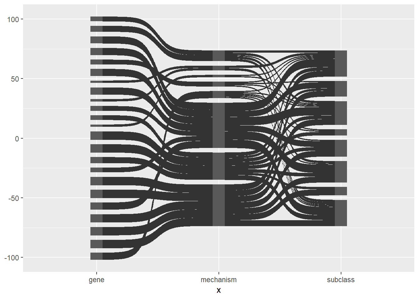
Here is the same plot with the links and nodes coloured by node.
ggplot(df_long, aes(x = x, next_x = next_x, node = node, next_node = next_node,
                    fill = factor(node))) +
        geom_sankey() +
        scale_fill_discrete(drop = FALSE)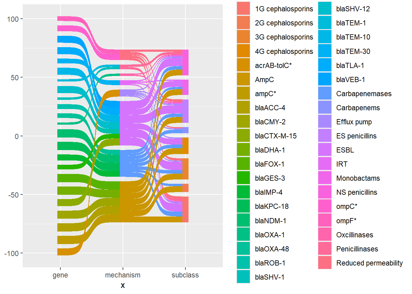
There is a lot to tidy up. First I removed the grey background, the grid, and x and y axis labels. I find that using theme_void() is the easiest way to do this. I also removed the legend using show.legend = FALSE.
ggplot(df_long, aes(x = x, next_x = next_x, node = node, next_node = next_node,
                    fill = factor(node))) +
        geom_sankey(show.legend = FALSE) +
        scale_fill_discrete(drop = FALSE) +
        theme_void()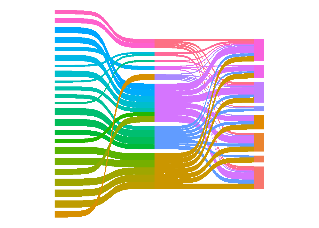
Next I added node labels.
ggplot(df_long, aes(x = x, next_x = next_x, node = node, next_node = next_node,
                    fill = factor(node))) +
        geom_sankey(show.legend = FALSE) +
        geom_sankey_text(aes(label = node)) +
        scale_fill_discrete(drop = FALSE) +
        theme_void()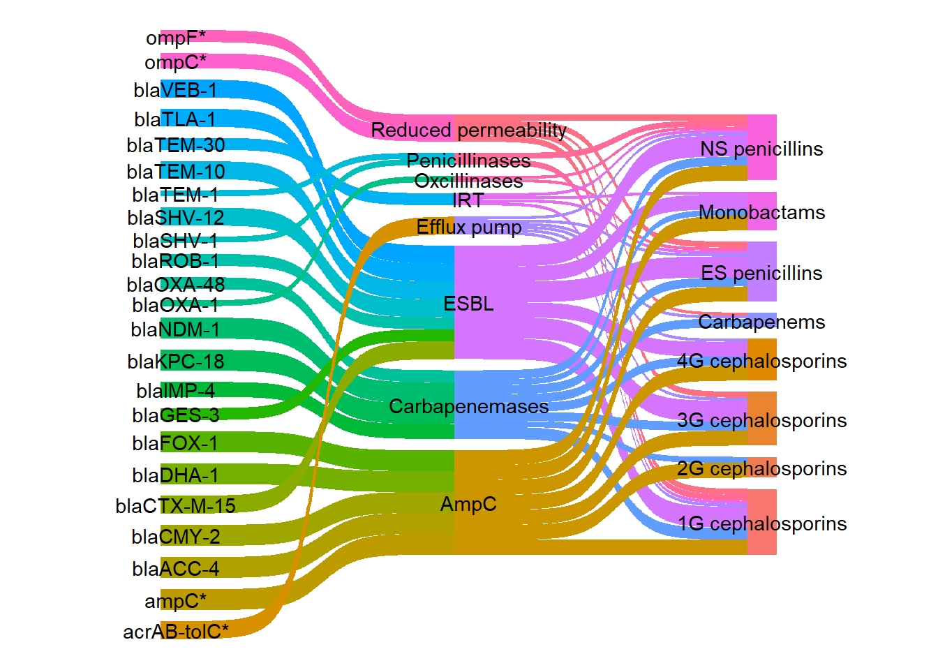
I wanted to change the colours of the links so that each gene would be coloured according to its mechanism using a more visually appealing colour palette compared with the default colours. First an extra column was added to the long dataframe to group the genes and mechanism rows by mechanism.
mechanism_lookup <- df %>%
        select(gene, mechanism) %>%
        rename(node = gene) %>%
        bind_rows(
                df %>%
                        distinct(mechanism) %>%
                        rename(node = mechanism) %>%
                        mutate(mechanism = node)) %>%
        distinct()

# Add mechanism info to the long data
df_long_coloured <- df_long %>%
        left_join(mechanism_lookup, by = "node")

head(df_long_coloured)
# A tibble: 6 × 5
x node next_x next_node mechanism
<fct> <chr> <fct> <chr> <chr>
1 gene ompC* mechanism Reduced permeability Reduced permeab…
2 mechanism Reduced permeability subclass NS penicillins Reduced permeab…
3 subclass NS penicillins <NA> <NA> <NA>
4 gene ompC* mechanism Reduced permeability Reduced permeab…
5 mechanism Reduced permeability subclass ES penicillins Reduced permeab…
6 subclass ES penicillins <NA> <NA> <NA> I selected my colours using the r-graph-gallery color-palette-finder. Shades of blue from the seeblau palette were used for the “Reduced permeability” and “Efflux pump” mechanisms. Shades of yellow, orange, and red from the amber_material palette were used for the beta-lactamase enzyme types.
#The two palettes that I selected my colours from:
paletteer_d("unikn::pal_seeblau")
<colors>
#CCEEF9FF #A6E1F4FF #59C7EBFF #00A9E0FF #008ECEFF paletteer_d("ggsci::amber_material")<colors>
#FFF8E1FF #FFECB3FF #FFE082FF #FFD54FFF #FFCA28FF #FFC107FF #FFB300FF #FFA000FF #FF8F00FF #FF6F00FF I defined my colour palette. All the antibiotic classes were defined as “other”.
my_colour <- c(
        "Reduced permeability" = "#A6E1F4FF",
        "Efflux pump" = "#0F7BA2FF",
        "Penicillinases" = "#FFECB3FF",
        "Oxcillinases" = "#FFD54FFF",
        "IRT" = "#FFC107FF",
        "ESBL" = "#FFA000FF",
        "AmpC" = "#FF6F00FF",
        "Carbapenemases" = "#DA291CFF",
        "Other" = "#B3B7B8FF" )
I filled the links by the new mechanism variable.
ggplot(
        df_long_coloured,
        aes(x = x, next_x = next_x, node = node, next_node = next_node,
                    fill = mechanism)) +
        geom_sankey(show.legend = FALSE) +
        geom_sankey_text(aes(label = node)) +
        scale_fill_discrete(drop = FALSE) +
        theme_void()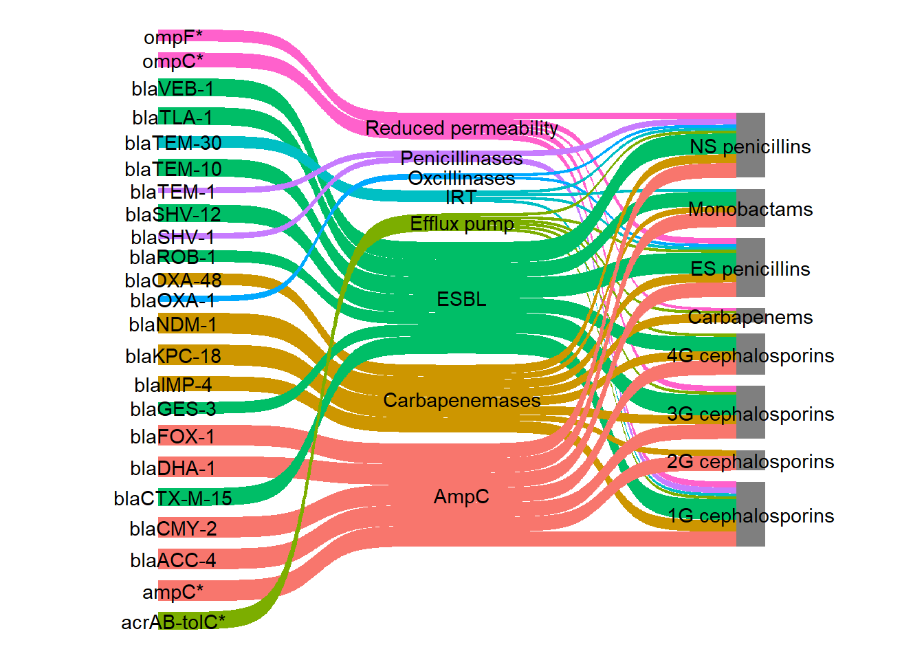
Although I now have the same colour for each mechanism, my colour palette has not been used therefore, scale_fill_discrete() was changed to scale_fill_manual(). The colours on the links were very bright so to make them slightly transparent I used the argument flow.alpha.
ggplot(
        df_long_coloured,
        aes(x = x, next_x = next_x, node = node, next_node = next_node,
                    fill = mechanism)) +
        geom_sankey(show.legend = FALSE) +
        geom_sankey_text(aes(label = node)) +
        scale_fill_manual(values = my_colour) +
theme_void() 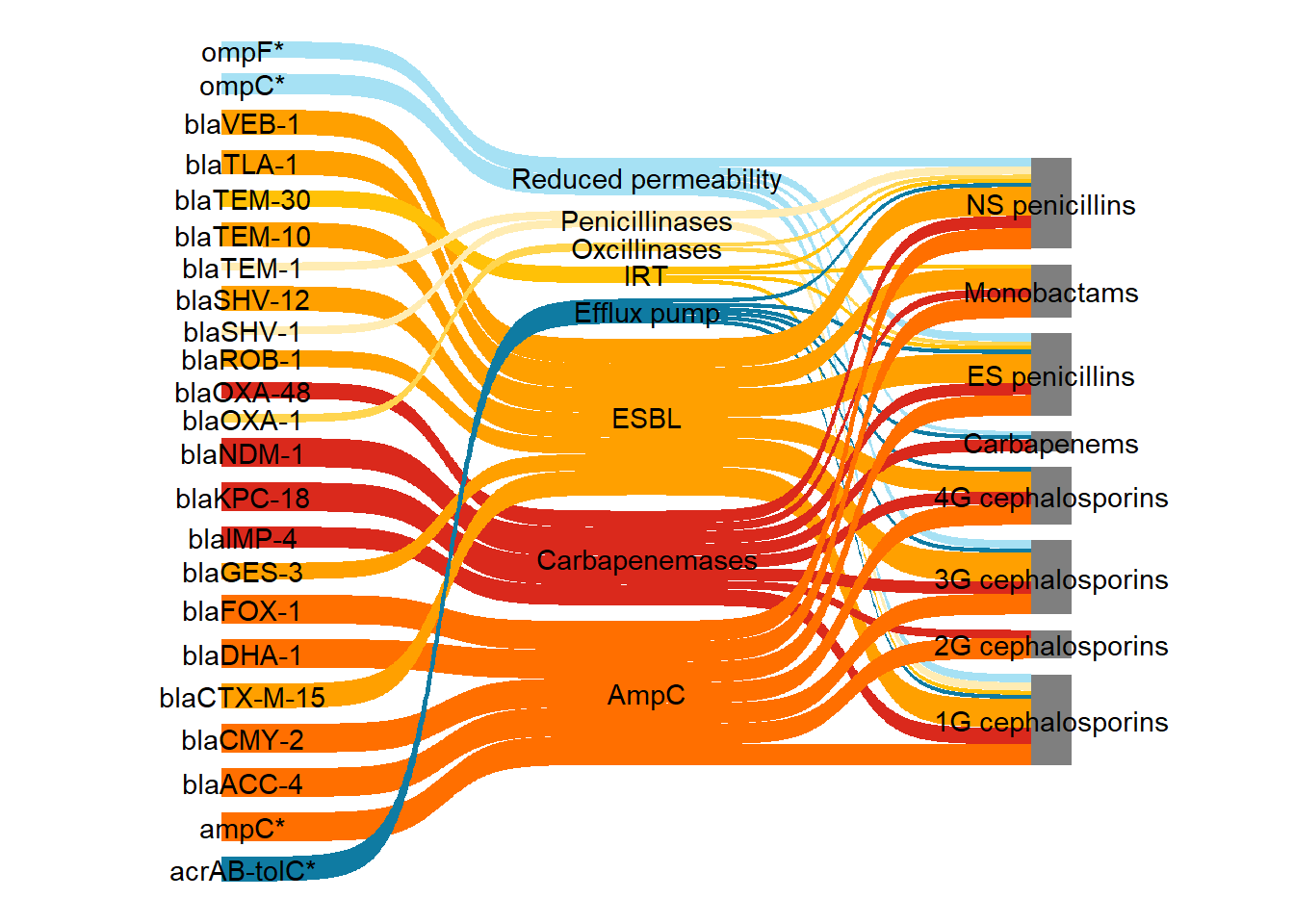
Next I left justified the first column labels and right justified the second column labels. This code was adapted from this stack overflow post. Here the function stage() was used to control the stage at which the aesthetics should be mapped.
ggplot(
        df_long_coloured,
        aes(x = x, next_x = next_x,
        node = node, next_node = next_node,
        fill = mechanism, label = node)) +
        geom_sankey(flow.alpha = 0.7,
                show.legend = FALSE) +
        geom_sankey_text(
                aes(
          x = stage(x, after_stat = x + 0.1 * case_when(
                                                  x == 1 ~ -1,
                                                  x == 3 ~ 1,
                                                  .default = 0)),
                    hjust = case_when(x == "gene" ~ 1,
                            x == "subclass" ~ 0,
                            .default = 0.5))) +
        theme_void() +
        scale_fill_manual(values = my_colour)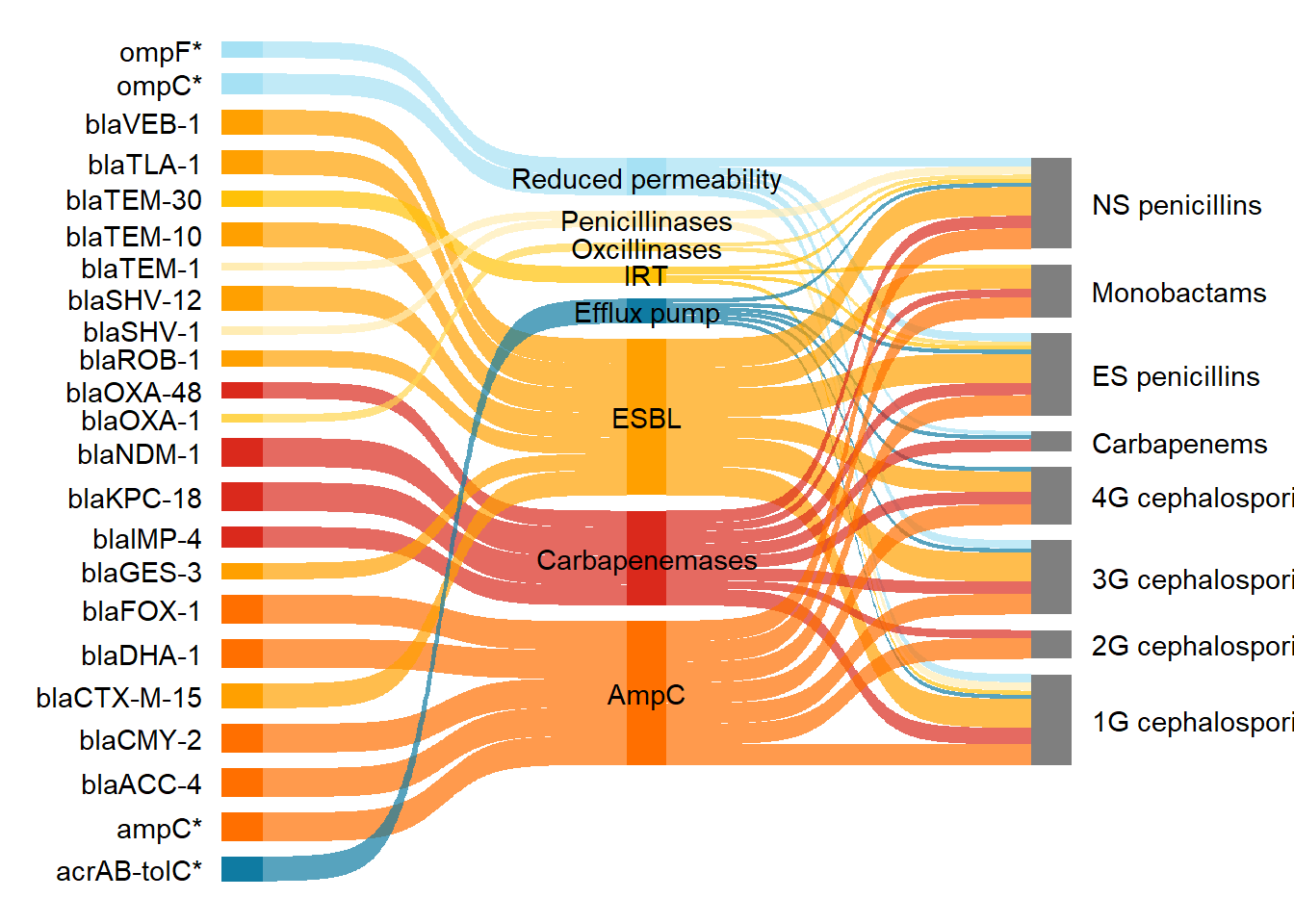
Next I reordered the nodes. See this link for more explanation on how to reorder nodes.
df_long_coloured2 <- df_long_coloured

df_long_coloured2$node <- factor(
  df_long_coloured$node,
  levels = rev(c(
    "ompC*", "Reduced permeability", "ompF*",
    "acrAB-tolC*", "Efflux pump",
    "blaTEM-1", "Penicillinases", "blaSHV-1",
    "blaOXA-1", "Oxcillinases",
    "blaTEM-30", "IRT",
    "blaTEM-10", "ESBL", "blaSHV-12", "blaCTX-M-15",
    "blaGES-3", "blaVEB-1", "blaROB-1", "blaTLA-1",
    "ampC*", "AmpC",
    "blaCMY-2", "blaDHA-1", "blaFOX-1", "blaACC-4",
    "blaKPC-18", "Carbapenemases",
    "blaOXA-48", "blaNDM-1", "blaIMP-4",
    "NS penicillins", "ES penicillins", "Monobactams",
    "1G cephalosporins", "2G cephalosporins",
    "3G cephalosporins", "4G cephalosporins", "Carbapenems"))
)

df_long_coloured2$next_node <- factor(
  df_long_coloured$next_node,
  levels = rev(c("Reduced permeability", "Efflux pump", "Penicillinases",
    "Oxcillinases", "IRT", "ESBL", "AmpC", "Carbapenemases",
    "NS penicillins", "ES penicillins","Monobactams","1G cephalosporins",
    "Carbapenems","2G cephalosporins","3G cephalosporins", "4G cephalosporins"))
)
The plot with the reordered nodes.
ggplot(df_long_coloured2, aes(
        x = x, next_x = next_x,
        node = node, next_node = next_node,
        fill = mechanism, label = node)) +
        geom_sankey(flow.alpha = 0.7,
                show.legend = FALSE) +
        geom_sankey_text(aes(
          x = stage(x, after_stat = x + 0.1 *case_when(
                                                  x == 1 ~ -1,
                                                  x == 3 ~ 1,
                                                  .default = 0)),
                    hjust = case_when(x == "gene" ~ 1,
                            x == "subclass" ~ 0,
                            .default = 0.5))) +
        theme_void() +
        scale_fill_manual(values = my_colour)
I italicised the gene names and changed the mechanisms to a bold style using plotmath syntax. First I added another column, which will be used for plotmath syntax, called label_pms. For example, to generate x in italic font use italic(x). Go to this link to read more on plotmath syntax. The paste() function was used to join strings together with no separator. I joined either the string "italic('", "bold('", or "plain('" with the node value (so the gene name), and the string "')". Then I changed those labels with a bla gene so that the enzyme type was written in subscript. The function str_replace_all() was used to replace any text with the literal string italic\\( followed by bla with the pattern of three word characters\\w{3}, a literal hyphen -, one word character \\w followed by one or more digits \\d or (|) the pattern of three word characters, hyphen, multiple digits.
#Add a new column called label_pms with the plotmath syntax for font styling
df_long_coloured3 <- df_long_coloured2 %>%
  mutate(label_pms = case_when(
    x == "gene" ~ paste0("italic('", node, "')"),
    x == "mechanism" ~ paste0("bold('", node, "')"),
    x == "subclass" ~ paste0("plain('", node, "')")
  ))

#Change the bla gene labels to subscript after bla
df_long_coloured3 <- df_long_coloured3 %>%
  mutate(label_pms = str_replace_all(label_pms,                                "italic\\('(bla)(\\w{3}-\\w-\\d+|\\w{3}-\\d+)'\\)",
                               "italic('\\1')[\\2]"))
Note that when you change the order of your nodes, you also need to set the levels for your labels so that they match the same order as your nodes.
df_long_coloured3$label_pms <- factor(
  df_long_coloured3$label_pms,
  levels = rev(c(
    "italic('ompC*')",
    "bold('Reduced permeability')",
    "italic('ompF*')",
    "italic('acrAB-tolC*')",
    "bold('Efflux pump')",
    "italic('bla')[TEM-1]",
    "bold('Penicillinases')",
    "italic('bla')[SHV-1]",
    "italic('bla')[OXA-1]",
    "bold('Oxcillinases')",
    "italic('bla')[TEM-30]",
    "bold('IRT')",
    "italic('bla')[TEM-10]",
    "bold('ESBL')",
    "italic('bla')[SHV-12]",
    "italic('bla')[CTX-M-15]",
    "italic('bla')[GES-3]",
    "italic('bla')[VEB-1]",
    "italic('bla')[ROB-1]",
    "italic('bla')[TLA-1]",
    "italic('ampC*')",
    "bold('AmpC')",
    "italic('bla')[CMY-2]",
    "italic('bla')[DHA-1]",
    "italic('bla')[FOX-1]",
    "italic('bla')[ACC-4]",
    "italic('bla')[KPC-18]",
    "bold('Carbapenemases')",
    "italic('bla')[OXA-48]",
    "italic('bla')[NDM-1]",
    "italic('bla')[IMP-4]",
    # Now the antibiotic subclasses in your desired order:
    "plain('NS penicillins')",
    "plain('ES penicillins')",
    "plain('Monobactams')",
    "plain('1G cephalosporins')",
    "plain('2G cephalosporins')",
    "plain('3G cephalosporins')",
    "plain('4G cephalosporins')",
    "plain('Carbapenems')"
  ))
)
When calling the ggplot() function I then added the arguments label = label_pms and parse = TRUE, to parse it as plotmath syntax.
ps <- ggplot(df_long_coloured3, aes(
    x = x, next_x = next_x,
    node = node, next_node = next_node,
    fill = mechanism, label_pms = node)) +
  geom_sankey(flow.alpha = 0.7, show.legend = FALSE) +
  geom_sankey_text(
    aes(label = label_pms,
        x = stage(x, after_stat = x + 0.1 *
          case_when(
            x == 1 ~ -1,
            x == 3 ~ 1,
            .default = 0)),
        hjust = case_when(x == "gene" ~ 1,
                          x == "subclass" ~ 0,
                          .default = 0.5)),
    parse = TRUE) +
  theme_void() +
  scale_fill_manual(values = my_colour)

ps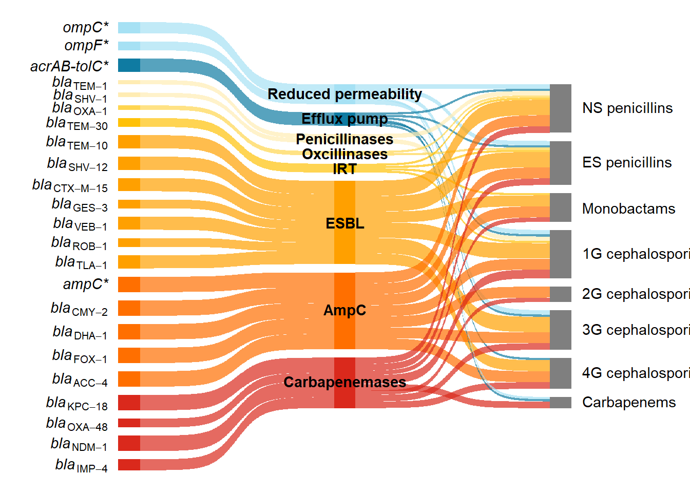
Lastly I added a caption. For adding captions, titles and customising ggplots I would recommend Nicola Rennie’s book ’The Art of Data Visualization with ggplot2”
caption1 <- "Beta-lactam resistance in <i>E. coli</i> predominantly occurs through the acquisition of genes encoding beta-lactamases (shades of yellow, orange, and red, according to enzyme group), but can also occur through mutations in genes encoding outer membrane proteins (light blue) or efflux pumps (dark blue); genes with mutations are marked with an asterisk. This Sankey diagram illustrates how beta-lactam resistance genes can be grouped by mechanism (reduced permeability, efflux pump and enzymatic inactivation by different beta-lactamases) and the subclasses of beta-lactams (NS - narrow spectrum and ES - extended spectrum penicllins; monobactams; 1G - first generation, 2G - second generation, 3G - third generation, 4G - fourth generation; and carbapenems) to which they confer resistance. The beta-lactamase enzymes have been grouped into penicillinases, oxacillinases, IRT (inhibitor resistant TEM), ESBL, AmpC, and carbapenemases. One representative gene variant is shown. However, resistance profiles can vary between different variants of the same enzyme and between different enzymes from the same group."


psc <- ps +
  labs(caption = caption1) +
  theme(plot.caption.position = "plot",
        plot.caption = element_textbox_simple(
          hjust = 0.5,
          margin = margin(t = 40, r = 5, b = 5, l = 5)))
psc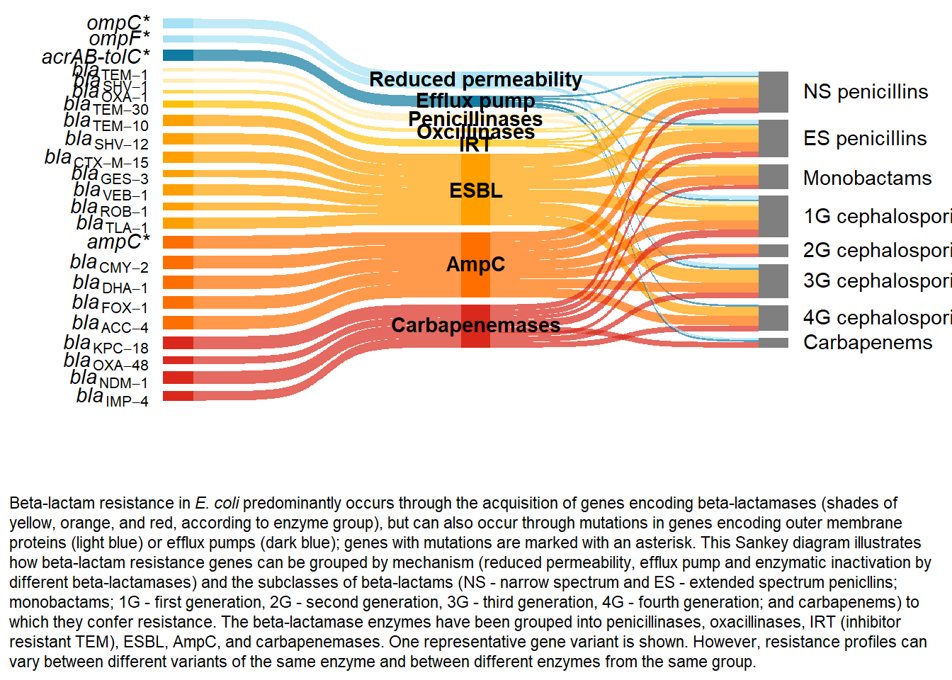
To attribute this work please cite:
Burgess, Sara. 2025. “Generating and polishing Sankey diagrams in R.” 14 November, 2025. https://sburgess2.github.io/sankey_amr/
References
1.
Sidjabat, H. E., Heney, C., George, N. M., Nimmo, G. R. & Paterson, D. L. Interspecies Transfer of bla\(_{\text{IMP-4}}\) in a Patient with Prolonged Colonization by IMP-4-Producing Enterobacteriaceae. Journal of Clinical Microbiology 52, 3816–3818 (2014).
2.
Mmatli, M., Mbelle, N. M., Maningi, N. E. & Osei Sekyere, J. Emerging Transcriptional and Genomic Mechanisms Mediating Carbapenem and Polymyxin Resistance in enterobacteriaceae: A Systematic Review of Current Reports. mSystems 5, e00783–20 (2020).
3.
Vourli, S. Novel GES/IBC extended-spectrum β-lactamase variants with carbapenemase activity in clinical enterobacteria. FEMS Microbiology Letters 234, 209–213 (2004).
4.
Dolatyar Dehkharghani, A., Haghighat, S., Rahnamaye Farzami, M., Rahbar, M. & Douraghi, M. Clonal Relationship and Resistance Profiles Among ESBL-Producing Escherichia coli. Frontiers in Cellular and Infection Microbiology 11, 560622 (2021).
5.
Papagiannitsis, C. C., Tzouvelekis, L. S., Tzelepi, E. & Miriagou, V. Plasmid-Encoded ACC-4, an Extended-Spectrum Cephalosporinase Variant from Escherichia coli. Antimicrobial Agents and Chemotherapy 51, 3763–3767 (2007).
6.
Briñas, L., Zarazaga, M., Sáenz, Y., Ruiz-Larrea, F. & Torres, C. Β-Lactamases in Ampicillin-Resistant Escherichia coli Isolates from Foods, Humans, and Healthy Animals. Antimicrobial Agents and Chemotherapy 46, 3156–3163 (2002).
7.
Hao, Y. et al. Genotypic and Phenotypic Characterization of Clinical Escherichia coli Sequence Type 405 Carrying IncN2 Plasmid Harboring bla\(_{\text{NDM-1}}\). Frontiers in Microbiology 10, 788 (2019).
8.
Kazmierczak, K. M. et al. Global Dissemination of bla\(_{\text{KPC}}\) into Bacterial Species beyond Klebsiella pneumoniae and In Vitro Susceptibility to Ceftazidime-Avibactam and Aztreonam-Avibactam. Antimicrobial Agents and Chemotherapy 60, 4490–4500 (2016).
9.
Vale, A. P., Shubin, L., Cummins, J., Leonard, F. C. & Barry, G. Detection of bla\(_{\text{OXA-1}}\), bla\(_{\text{TEM-1}}\), and Virulence Factors in E. Coli Isolated From Seals. Frontiers in Veterinary Science 8, 583759 (2021).
10.
Liakopoulos, A., Mevius, D. & Ceccarelli, D. A Review of SHV Extended-Spectrum β-Lactamases: Neglected Yet Ubiquitous. Frontiers in Microbiology 7, (2016).
11.
Zhang, B. et al. In vitro activity of aztreonam–avibactam against metallo-β-lactamase-producing Enterobacteriaceae—A multicenter study in China. International Journal of Infectious Diseases 97, 11–18 (2020).
12.
Bradford, P. A. Extended-Spectrum β-Lactamases in the 21st Century: Characterization, Epidemiology, and Detection of This Important Resistance Threat. Clinical Microbiology Reviews 14, 933–951 (2001).
13.
Kang, H. J., Lim, S.-K. & Lee, Y. J. Genetic characterization of third- or fourth-generation cephalosporin-resistant avian pathogenic Escherichia coli isolated from broilers. Frontiers in Veterinary Science 9, 1055320 (2022).
14.
Jacoby, G. A. AmpC β-Lactamases. Clinical Microbiology Reviews 22, 161–182 (2009).
15.
Bush, K. & Bradford, P. A. Epidemiology of β-Lactamase-Producing Pathogens. Clinical Microbiology Reviews 33, e00047–19 (2020).
16.
Rennie, N. Introducing The Art of Visualization with ggplot2. https://nrennie.rbind.io/blog/art-of-viz-book/ (2025).